Money Supply and the Value of the Market
Derek Justin McCloud posted on Facebook a link to S&P500 priced in gold as a way to value the market for “true inflation” as apposed to using the posted rate for product price inflation.
This isn't a new idea, nor an unknown debate. Product price inflation is an index of prices and the official inflation rate is posted regularly. Many economists and investors use this product price inflation as the basis of their adjusted calculations against the dollar. The debate is around if this rate is what should be used.
The average price of products is effected by many things. Is the value of money really equal to the average price of products? According to Ludwig Von Mises, one of the more prominent economists of the 20th century, the value of all money in an economy equals the need for money by that economy. Essentially the idea is that the value of money reflects how well the economy is doing. This could be more easily seen if the number of monetary units within that economy were finite, but that's not what happens with most national currencies. As governments issue more units the value of those units fall in relation the value of the economy because each unit is a fraction of the economy and creating more units makes the fraction each unit holds less.
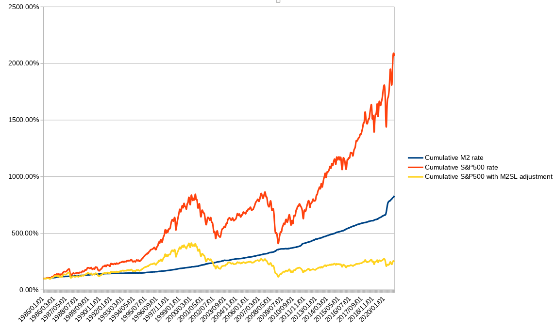
I don't think gold is a stable medium to use as a basis in calculating the true value of the market – call this “real” inflation adjusted. I decided to create a chart to depict the real inflation as the M2 money supply. Even the traditional economists that use the product price index as their inflation amount often use the M2 money supply as the precursor or indicator of future product price inflation.
If the money supply were finite how might the market look today? Have the printers of new money awarded the value of the growth of the public market to the first receivers of the new money?
The first chart below shows the cumulative M2SL money supply, S&P500, and S&P500 adjusted for the M2SL money supply starting in 1985. These are all shown as percent compared to the first point.
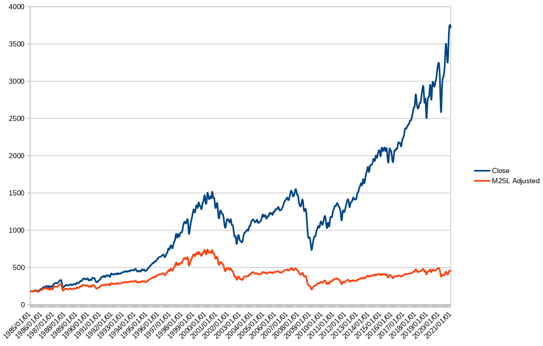
The second chart shows the nominal price of S&P500 and the M2SL adjusted nominal price of the S&P500 starting in 1985.


Made with data from, https://fred.stlouisfed.org/series/M2SL#0 and https://finance.yahoo.com/quote/%5EGSPC/history